
Beginners Guide to Graphics Design for Your Social Media Post.
The world keeps changing very fast and the invent of social media has brought about a lot of benefits in business and our respective social lives. Recent study shows that there are over 3 billion persons that use social media networks across the world. These people use social media not just to interact with friends and families, but also to interact and engage with brands and businesses around their vicinity and all around the world. It is paramount as a brand you communicate effectively to your followers or customers with contents that not only stands out but memorable.
Before we dive in, it is important we define graphics design. When the term graphics design is mentioned what comes to mind is a poster, beautifully designed flyers, business cards or logos and so on. While these are examples under graphics design, it doesn’t fully define what graphics design is about.
In very simple words, Graphics design is the art or profession of visual communication that combines images, words, and ideas to convey information to an audience.
In this guide, I’d introduce you to some basic graphic design principles and tips that’ll greatly improve your designs for social media as a beginner.
Basic graphics design principles every beginner should know.
Every field or discipline has rules and principles that govern such discipline. It is of the essence every beginner should be aware of the principles and elements that make up design. The basic principles include
- Emphasis
- Alignment
- Contrast
- Repetition
- Proportion
- Movement
- Space
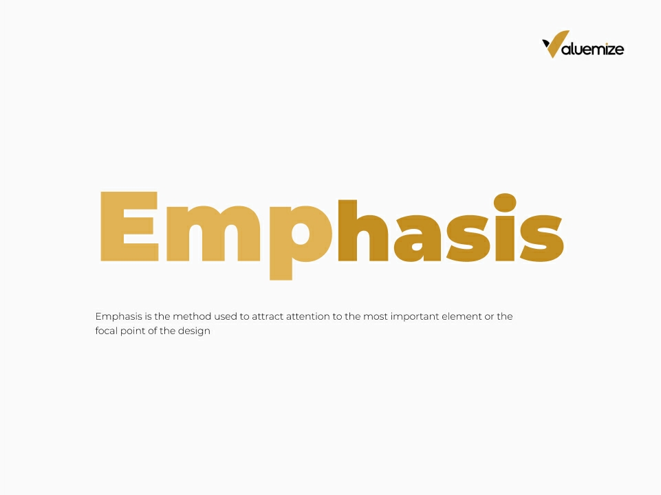
Emphasis
Emphasis is the method used to attract attention to the most important element or the focal point of the design. Emphasis can be achieved in several ways such as using colour, size, position, texture and patterns.
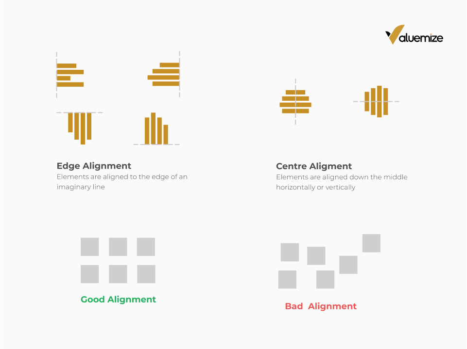
Alignment
Alignment refers to the placing or arranging of elements in a design. Designers use this principle to organize elements thereby creating order, balance or a defined structure. When used properly in your design composition, it gives a pleasant and neat effect. Alignment could be simple and complex, as a beginner always keep things simple.
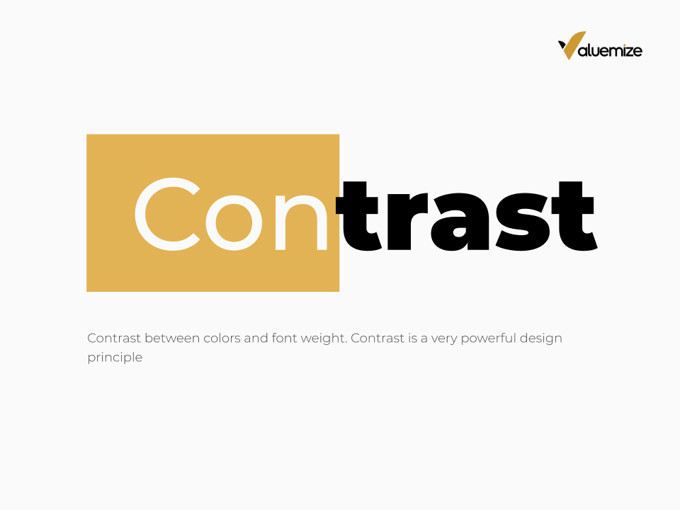
Contrast
Contrast literally means a state of being strikingly different. This also applies to design. It is the difference between two or more design elements. It is used to show importance, create interesting visual content. Contrast when used properly can result in stunning compositions. There are various ways contrast occurs in design.
Contrast between colour of typography and colour of background, Light and dark colours, Big and small elements, Rough vs smooth textures, illustration and photos, between two different font typeface, Bold and regular font weight, Bright and dull colours, Geometric and organic shapes.
Repetition
The principle of repetition simply means the reuse of similar or the same visual elements in your design. Repetition is used a lot in branding. Well, you’ve come this far in the article. Take a step backward and look at the visual contents. What do you notice? Do you see colors repeating? What about font typeface? The logo? It’s important to note this principle of design. It brings about consistency and cohesiveness in your design. Take a moment and look at one or two of the top brands you follow on social media to gain a better understanding.

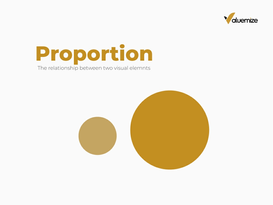
Proportion
Proportion refers to the relationship in scale between one element relative to another element.
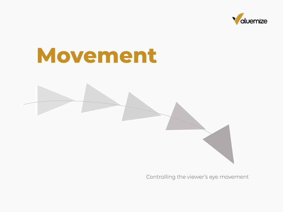
Movement
Movement in design refers to the direction or path the viewer’s eye follows when scanning a design. The way a designer arranges elements such as lines and shapes, can be used to guide a viewer’s eyes through the design. Guiding the viewer from one information to another. It’s paramount that every beginner knows how to effectively use this principle because when used poorly it can result in bad design and miscommunication.
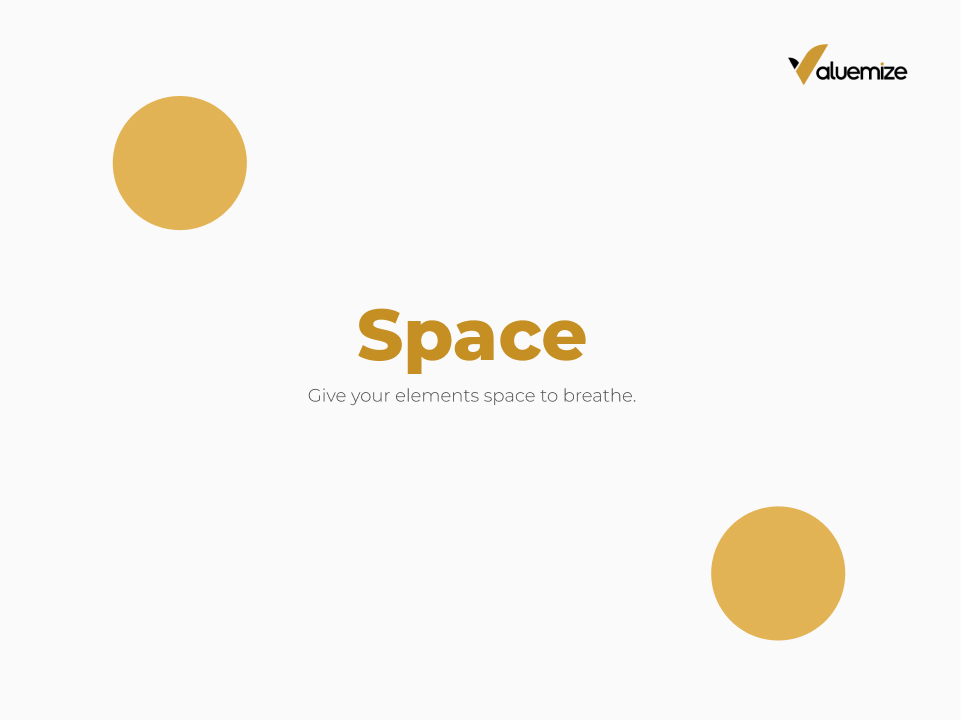
Space
Space in design refers to the area around your elements. There are several terms people use to refer to space such as Negative space, positive space, white space. Negative space and white space frequently which are frequently used they all usually just refer to space. Space is one design principle most amateur faults at. Space in design can be used to communicate several things, Can be used to group elements, Create hierarchy amongst elements.
It is very important your elements have enough space around. When elements are all packed with no space between, it hinders legibility and causes strain in communication. Whitespace makes your design easy to navigate.
Recommendation
Graphics design is so broad and requires a lot of study to fully master the skill.
Designing from Scratch with Canva
Consistency in brand messaging is key. Schedule a free strategy call with us to give your business the edge it deserves.